
Container haulage article
Logistics KPI dashboard: the complete guide for UK operations
Discover how to build an effective logistics KPI dashboard that transforms data into actionable decisions and enhances supply chain efficiency.
An effective logistics KPI dashboard does one thing above everything else: it turns data into a decision before the window to act closes. Not a report. Not a summary. A trigger.
If you are building or rebuilding a supply chain dashboard, start here:
Dashboard must-haves at a glance:
- Live exceptions surfaced above the fold (shipments breaching SLA, OTIF below threshold)
- Trend vs target for each KPI, not just a current value
- Named owner and a defined next action attached to every metric
- Refresh cadence matched to the decision cycle appropriate for operations, network management, and finance
Your next 24–72 hours:
- Pick one dashboard job (e.g. “catch late departures before they miss the port cut-off”)
- Identify the three KPIs that directly signal that problem
- Name one person who owns each KPI and write down what they do when it turns red
Three metrics no logistics dashboard should launch without: OTIF (On Time In Full), cost per shipment, and empty miles percentage. Get those three right before you add anything else.
Key takeaways
A logistics KPI dashboard only delivers value when each metric is owned, thresholded, and embedded in a daily decision ritual — without those three elements, it is a report with better graphics.
| Point | Details |
|---|---|
| Start with one job | Define the dashboard’s single purpose in one sentence before selecting any KPIs. |
| Limit to 5–8 KPIs per role | Operational, tactical, and strategic views each need a different, role-matched metric set. |
| OTIF, cost per shipment, empty miles | These three metrics should be on every logistics dashboard before any others are added. |
| Threshold alerts need owners | Every amber or red alert must name an owner and a defined next action, or it is noise. |
| Haulier for container haulage | Haulier’s AI-assisted transport desk captures POD, availability, and quoting data in real time, giving container-haulage KPI dashboards a reliable event feed. |
Table of Contents
- What is a logistics KPI dashboard and why does it change operations?
- Why measure logistics with dashboards rather than reports?
- Essential logistics KPIs: formulas, targets, and who owns each one
- How do you build a logistics KPI dashboard that drives action?
- How do you choose the right KPIs and avoid vanity metrics?
- Staged implementation plan and typical UK cost considerations
- Which tools and BI platforms work best for UK logistics dashboards?
- What do useful logistics dashboards actually look like?
- Real-world insight: how dashboard-first principles apply to UK container haulage
- Sources
- FAQ
What is a logistics KPI dashboard and why does it change operations?
A logistics KPI (Key Performance Indicator) dashboard is a live visual interface that aggregates performance data from across your transport, warehouse, and supply chain systems into a single, role-specific view. The definition matters less than the design principle: a dashboard that only reports history is a scorecard. A dashboard that surfaces exceptions, shows trends against targets, and names an owner is an operational tool.
The data feeding a useful dashboard typically comes from several source systems working in concert. A Transport Management System (TMS) contributes shipment status, carrier performance, and freight cost data. A Warehouse Management System (WMS) provides pick rates, dock-to-stock times, and inventory accuracy. An ERP such as Dynamics 365 Business Central or NetSuite holds order and financial data. Telematics feeds vehicle location and empty-miles data. Carrier APIs bring in real-time ETA updates. None of those systems alone gives you the full picture; the dashboard is the layer that joins them.
Consider what happens when an OTIF tile turns red. In a reporting-only setup, a manager sees the number drop at the end of the day and spends the next morning working out what caused it. In an action tile setup, the dashboard fires an alert the moment OTIF breaches its threshold, names the carrier or lane responsible, and presents the owner with a suggested next step: rebook, escalate, or call the driver. The intervention window stays open. That is the operational difference.
The OTIF standard itself illustrates why definitions matter. Some contracts define OTIF as delivery within a one-hour window; others allow a full day. Agreeing the definition before building the tile is not a technical detail — it is the difference between a metric your team trusts and one they argue about every Monday.
Why measure logistics with dashboards rather than reports?
The core benefit is speed of intervention. A team working from end-of-day exports is always fighting yesterday’s fires. Real-time dashboards connected to ERPs and TMS keep the intervention window open; by the time a stale report lands in an inbox, the truck has already missed the port cut-off.
Beyond speed, well-designed dashboards deliver three further benefits:
- Faster decisions at every level. Dispatchers catch exceptions before they escalate. Operations managers spot network patterns within hours, not days. Executives see margin trends before month-end closes.
- Daily risk capture. A dashboard embedded in a morning stand-up forces the team to look at the same numbers at the same time. Disagreements about what is happening get resolved against a shared screen, not competing spreadsheets.
- Cross-functional alignment. When finance, operations, and commercial teams pull KPIs from the same governed source, the “your numbers don’t match mine” argument disappears.
The pitfalls are just as predictable. Vanity metrics — figures that look impressive but trigger no action — are the most common. Tracking total shipment volume on an executive dashboard sounds useful until you realise no one changes their behaviour based on it. Inconsistent KPI definitions across teams (two people calculating OTIF differently) destroy trust faster than any data quality issue. Stale refresh cadences mean the dashboard shows last night’s position when the team needs this morning’s. Mixed data grain — combining shipment-level and order-level data in the same tile — produces numbers that cannot be drilled into sensibly.
Pro Tip: Before adding any KPI to a dashboard, ask: “If this number changes by 10%, what does the named owner do differently?” If the answer is “nothing”, remove it. Threshold alerts with colour coding only earn their place when they are tied to an owner and a defined action.
Essential logistics KPIs: formulas, targets, and who owns each one
Limit any single dashboard view to 3–8 KPIs matched to the role using it. An operational dispatcher needs different metrics from a network manager or a CFO. Role-based dashboards with matched refresh cadences and a single data grain prevent the chronic problem of inconsistent numbers across teams.
The table below covers the core metrics across six categories. Targets are indicative benchmarks; your contractual SLAs and baseline performance should set the actual thresholds.
A note on OTIF definitions. The retail sector often applies a strict OTIF that counts a delivery as failed if even one unit is short or one hour late. Third-party logistics contracts may use a looser window. Before you build the tile, agree the definition in writing with the relevant commercial owner. Two teams calculating OTIF differently will never trust the same dashboard.
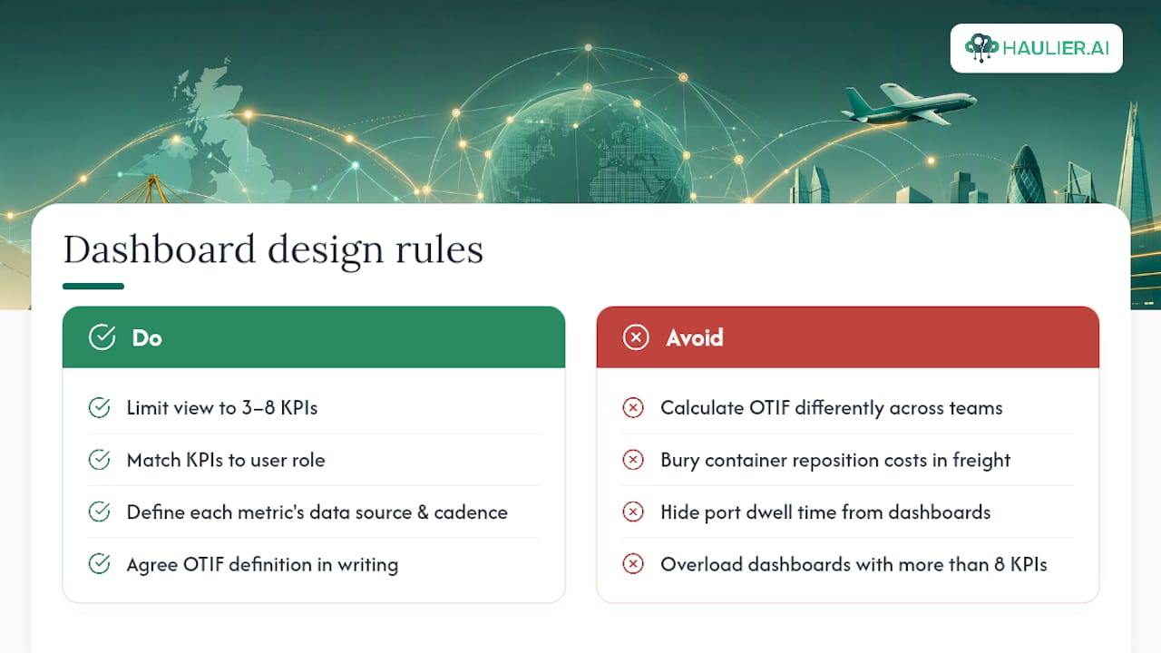
UK-specific considerations. Port dwell time at major UK container ports (Felixstowe, Southampton, Tilbury, Teesport) is a material input to OTIF for container haulage operations. Container repositioning costs are sensitive to availability fluctuations and should be tracked as a separate cost line rather than buried in freight cost per shipment. Depot turnaround time directly affects both cost per shipment and OTIF in container flows and deserves its own tile in any container-haulage dashboard.
Sustainability metrics such as CO₂ per shipment are increasingly treated as operational KPIs rather than annual reporting figures, particularly where customers have Scope 3 reduction commitments. If your contracts include carbon targets, track CO₂ per shipment at the same cadence as cost per shipment.
A useful logistics dashboard shows 5–8 KPIs a role acts on, supports drill-down from metric to lane, carrier, and shipment, and defines the data source and refresh cadence for each metric.
How do you build a logistics KPI dashboard that drives action?
The single job this section helps you complete: turn a KPI into a repeatable decision. Dashboards must be designed to change what the team does; pick one job for the dashboard, limit KPIs to a defendable few, attach an owner and action to each metric, and embed a daily decision ritual.
Step-by-step build sequence
- Define the dashboard’s single job. Write it in one sentence: “This dashboard helps the morning shift dispatcher catch shipments at risk of missing the port cut-off before 07:00.” Everything else follows from that sentence.
- Select 5–8 KPIs that directly serve that job. For the dispatcher example: OTIF live, ETA accuracy, shipments departing late, driver check-in status, port cut-off countdown.
- Map each KPI to its data source and grain. Every KPI needs a source system, a primary key (shipment ID or trip ID), and a refresh cadence. Mixing order-level and shipment-level data in the same tile is one of the most common causes of numbers that cannot be reconciled.
- Set SLA targets and thresholds. For each KPI, define the green/amber/red boundaries. Amber should trigger a notification; red should trigger an escalation workflow.
- Name an owner and a next action for every threshold breach. “OTIF < 90% → Transport Manager → review carrier performance log and call carrier account manager.”
- Design the visual layout. Exception tiles at the top, trend charts in the middle, drill-down tables at the bottom. Keep the primary view to one screen without scrolling.
- Embed a daily decision ritual. The dashboard only changes behaviour if the team uses it at a fixed time. A 10-minute morning stand-up in front of the screen is more valuable than a sophisticated dashboard nobody opens.
- Review and prune monthly. Any KPI that has not triggered an action in 30 days is a candidate for removal.
Data-mapping example
Threshold rules and alert design
A well-designed alert contains four elements: the metric name and current value, the threshold it has breached, the named owner, and a suggested next action. Owner: Sarah T. Suggested action: check carrier ETAs for jobs 4421–4430" is a decision prompt.
Amber is the most important colour — it is the warning before the problem, and most dashboards underuse it.
By the time a metric turns red, the intervention window is often already closing.*
How do you choose the right KPIs and avoid vanity metrics?
Select KPIs that change behaviour, are owned by a named individual, and have clean, consistently defined data. Those three criteria eliminate roughly half the metrics that typically appear on first-draft dashboards.
A simple prioritisation approach: plot each candidate KPI on a two-axis matrix. The horizontal axis is actionability (can the named owner do something about it within 24 hours?). KPIs that score high on both axes belong on the dashboard. KPIs that score high on impact but low on actionability belong in a monthly strategic review, not a live operational tile. KPIs that score low on both should be dropped entirely.
Signals a KPI should be removed:
- No named owner has been identified after two weeks of trying
- The metric has not triggered a documented action in the past 30 days
- The data source requires manual extraction or cleansing before the figure is usable
- Two teams calculate it differently and neither will change their definition
- The metric moves with a lagging indicator that is already on the dashboard (e.g. tracking both “late departures” and “OTIF” at the same grain often means one is redundant)
Target-setting approaches
Benchmark-based. Set the target against an industry benchmark or peer group.
Contractual SLA. Where a customer contract specifies a service level, that figure becomes the minimum threshold. The amber alert should sit 3–5 percentage points above the contractual floor so the team has time to recover before a penalty clause triggers.
Trend-based improvement. For metrics where no external benchmark exists (e.g. picks per hour at a specific site), set the target as a percentage improvement on the trailing 90-day average.
Staged implementation plan and typical UK cost considerations
A phased rollout prevents the most common failure mode: a technically complete dashboard that nobody uses because the team was not involved in building it.
Implementation phases
| Phase | Duration | Typical owners | Expected outcome |
|---|---|---|---|
| 1. Quick wins | Weeks 1–4 | Ops manager, BI analyst | 3–5 KPIs live from existing data sources; daily ritual established |
| 2. Foundational integration | Weeks 5–12 | IT/data engineer, TMS/WMS admin | TMS, WMS, and ERP connected to a central data layer; single shipment grain enforced |
| 3. Role-based rollouts | Weeks — | Ops manager, finance lead, commercial owner | Separate operational, tactical, and executive dashboards live with role-matched refresh cadences |
| 4. Optimisation | Weeks — | BI analyst, data governance lead | Threshold alerts automated; KPI definitions formally governed; monthly pruning cycle in place |
Roles
The operations manager leads the programme and owns the KPI selection decisions. A BI or data analyst builds and maintains the dashboard layer. IT or a data engineer handles system integrations and the data pipeline. Finance owns cost KPIs and validates the data against ERP records. A commercial owner (head of logistics or supply chain director) signs off on targets and thresholds, particularly where they are tied to customer SLAs.
Cost buckets for UK operations
- Data integration and ETL. Connecting TMS, WMS, and ERP to a central data warehouse is typically the largest cost item. Complexity varies significantly by system age and API availability.
- BI tool licences. Power BI Pro licences are priced per user per month; Tableau and Looker Studio have their own pricing structures. For SME operations, Microsoft Excel with Power Query can defer BI tool costs in early phases.
- Developer or consultancy time. Custom dashboard builds and integration work are typically charged on a day-rate basis by UK consultancies.
- Data warehouse or cloud storage. Azure Synapse, Google BigQuery, and Amazon Redshift are common choices; costs scale with data volume and query frequency.
- Change management and training. Often underbudgeted. Plan for at least two structured training sessions per role group and ongoing support for the first 90 days.
Suggested ROI metrics to track the programme itself: reduction in late deliveries (measured against pre-dashboard baseline), reclaimed freight audit savings (disputes resolved faster with POD data), and improved vehicle utilisation (empty miles reduction).
Which tools and BI platforms work best for UK logistics dashboards?
The right platform depends on your organisation’s size, existing stack, and latency requirements. The architecture question comes first: do you need a data warehouse feeding a BI layer, direct API connections for real-time data, or embedded dashboards inside your TMS or ERP?
A governed, real-time dashboard requires unified data ingestion, governed KPI definitions, and workflow automation — the platform choice matters less than whether those foundations are in place.
Platform profiles
Power BI is the most widely deployed BI tool in UK logistics operations, largely because most mid-market and enterprise organisations already have Microsoft licences. Its native connectors to Dynamics 365 Business Central and Azure data services reduce integration effort significantly. For logistics managers already in the Microsoft ecosystem, Power BI is the lowest-friction path to a working dashboard. The transition from end-of-day reports to real-time Power BI dashboards is one of the most commonly cited drivers of improved operational visibility in UK freight operations.
Tableau offers stronger data visualisation flexibility and is preferred by organisations with complex multi-source data environments or where the analytics team has existing Tableau skills. It connects well to most TMS and WMS platforms via ODBC or REST API. Licensing costs are higher than Power BI for equivalent user counts.
Looker Studio (formerly Google Data Studio) is free at the base tier and integrates natively with Google BigQuery and Google Sheets. For smaller operations or teams already using Google Workspace, it provides a fast route to a working dashboard without licence costs. Its real-time capabilities are more limited than Power BI or Tableau for high-frequency operational data.
Microsoft Excel with Power Query remains the practical starting point for many UK SME logistics operations. It is not a long-term dashboard platform, but it is the fastest way to prove a KPI model before committing to a BI tool. The risk is that Excel dashboards become entrenched and block the move to a governed data layer.
Dynamics 365 Business Central is an ERP, not a BI tool, but it is a critical data source for cost and order KPIs. Its native Power BI integration means organisations on Business Central can surface financial and order data in a dashboard with relatively little custom development.
NetSuite serves a similar role as an ERP data source, particularly for organisations with complex multi-entity or international structures. NetSuite’s SuiteAnalytics module provides some built-in reporting, but most operations teams connect it to Power BI or Tableau for operational dashboards.
Integration patterns by organisation size
- SME (under 50 vehicles or under 5,000 shipments/month). Excel with Power Query for data preparation, Power BI Desktop for visualisation. Connect directly to TMS and ERP via ODBC or flat-file export. Acceptable for daily refresh cadences.
- Mid-market. Power BI or Tableau connected to a lightweight data warehouse (Azure SQL, Google BigQuery). TMS and WMS data ingested via scheduled ETL. Supports hourly refresh for operational tiles.
- Large or complex operations. Real-time API integrations from TMS, WMS, telematics, and carrier platforms into a cloud data warehouse. Embedded BI dashboards inside the TMS for dispatcher-level views. Power BI or Tableau for network and executive layers. Supports near-real-time refresh (sub-15 minutes) for exception monitoring.
For UK transport management system selection, the integration capability of the TMS with your chosen BI platform should be a primary evaluation criterion — not an afterthought.
What do useful logistics dashboards actually look like?
Each dashboard template serves a specific role and a specific decision. The job of the template determines which KPIs it shows, how frequently it refreshes, and what the primary drill path is.
Operational dashboard (dispatcher or hub manager)
Job: Catch exceptions before they become failures. Used at the start of each shift and checked continuously throughout the day.
KPIs to show (5–8): Live OTIF %, shipments departing late (count and %), ETA accuracy %, driver check-in status, port cut-off countdown (for container operations), active exceptions by carrier.
Layout: Exception tiles across the top row (red/amber/green). A live shipment map or status list in the centre. A drill-down table of at-risk shipments at the bottom, sortable by departure time and carrier.
Primary drill path: Click an amber OTIF tile → filter to the affected lane → filter to the affected carrier → view individual shipment records → see driver status and last known location.

Minimum dataset: Shipment ID, planned and actual departure time, carrier name, lane (origin/destination), driver ID, ETA (carrier-reported), POD timestamp, port cut-off time.
Tactical dashboard (operations manager or network manager)
Job: Identify patterns across lanes, carriers, and time periods to inform weekly planning decisions.
KPIs to show (5–8): OTIF % by lane and carrier (7-day rolling), freight cost per shipment (week-on-week trend), empty miles % by depot, order cycle time, dock-to-stock time, picks per hour (warehouse sites).
Layout: Trend charts for the primary KPIs across the top. A carrier/lane performance matrix in the centre. A cost breakdown by lane or mode at the bottom.
Primary drill path: Click a carrier with falling OTIF → view shipment-level detail for that carrier → identify whether the issue is concentrated on specific lanes, time windows, or driver groups.
Minimum dataset: All operational fields plus freight cost per shipment, order line data from ERP, warehouse pick records from WMS, vehicle mileage from telematics.
Strategic dashboard (executive or commercial director)
Job: Track whether the logistics operation is delivering against commercial targets and identify where investment is needed.
KPIs to show (5–8): OTIF % (monthly trend), total freight cost as % of revenue, cost per order line (trend), empty miles % (trend), CO₂ per shipment (trend), customer complaint rate linked to logistics.
Layout: Scorecard tiles at the top showing current period vs target and prior period. Trend lines for each KPI over a 12-month rolling window. A single exception summary: which KPIs are off-target and who owns the recovery plan.
Refresh cadence: Weekly for most tiles; monthly for cost and sustainability metrics aligned to financial close.
A three-layer dashboard architecture — live operational, daily rollup, and executive — is the pattern that freight forwarders and similar operations find most effective for closing the gap between real-time operations and month-end reporting.
Real-world insight: how dashboard-first principles apply to UK container haulage
Container haulage operations in the UK face a specific set of KPI challenges that generic logistics dashboards often miss. Port dwell time, container availability, and depot turnaround are not standard fields in most TMS platforms, yet they are material drivers of both OTIF and cost per shipment.
Haulier applies dashboard-first principles directly to these problems. The platform captures proof-of-delivery data digitally and links it to OTIF and billing in a single event record. When a digital proof of delivery is confirmed, the OTIF tile updates, the billing trigger fires, and the exception clears — without a manual data entry step. That single instrumentation point eliminates one of the most common sources of stale data in container-haulage KPI models.
Practical recommendations for integrating marketplace signals into KPI models:
- Quote acceptance rate by haulier. Track the ratio of quotes accepted to quotes sent per haulier. A falling acceptance rate is an early signal of capacity tightening or rate misalignment — visible days before it shows up in OTIF.
- Haulier availability by port and date. Availability data from a marketplace platform feeds directly into forward-looking capacity KPIs. Knowing that Tilbury availability is constrained on a specific date allows the network planner to act before a shipment is booked.
- Container repositioning cost per movement. Track separately from standard freight cost per shipment. Repositioning costs spike during port congestion events and distort the freight cost trend if not isolated.
- Depot turnaround time. Container depot KPIs including turnaround time and availability directly affect both cost per shipment and OTIF. Build a depot tile into any container-haulage dashboard that covers multiple collection or return points.
For driver app data to feed reliably into KPI models, the app must capture timestamps at each event (departure, arrival, POD) and write them to the same shipment ID used by the TMS. Without that shared key, the data sits in a silo and the dashboard cannot reconcile it.
The week-one checklist that actually matters
Most dashboard projects stall because they try to solve everything at once. In week one, the goal is not a finished dashboard. The goal is one defended KPI, one named owner, and one decision ritual.
The checklist that works in practice:
- Day 1–2: data ownership audit. For each candidate KPI, identify who owns the source system and whether the data is clean enough to use today. Do not build on data you cannot trust.
- Day 3: pick one KPI. Choose the metric that is most directly linked to your biggest current operational problem. For most UK container-haulage operations, that is OTIF or cost per shipment.
- Day 4: set the threshold and name the owner. Write it down: “If OTIF drops below X%, [name] does [specific action] within [timeframe].”
- Day 5: establish the decision ritual. Book a recurring 10-minute slot where the team looks at the dashboard together. The ritual matters more than the sophistication of the dashboard.
The most common surprise in UK container-haulage projects is how much port timing variability affects KPI baselines. Gate-in cut-offs at Felixstowe or Southampton can shift by hours during peak periods, and a KPI model that uses a fixed cut-off time will generate false exceptions. Build port-specific cut-off times as a configurable parameter, not a hardcoded value.
Haulier makes container-haulage KPI inputs reliable
Reliable KPI data starts with reliable event capture. For UK freight forwarders and importers, the weakest link is usually the gap between what happens on the road or at the port and what gets recorded in the system.
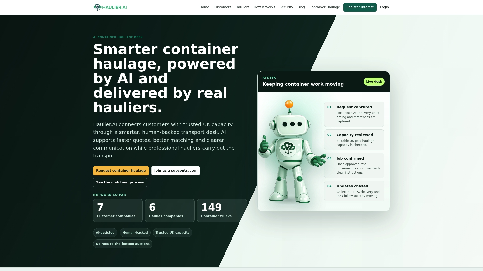
Haulier addresses that gap directly. The platform’s AI-assisted transport desk captures availability, quoting, communication updates, and proof-of-delivery in a single workflow, so the data feeding your OTIF and cost-per-shipment tiles reflects what actually happened rather than what someone remembered to enter. Hauliers control their own rates and can decline unsuitable jobs, which means the capacity data is live and accurate rather than aspirational.
For freight forwarders and logistics managers running container haulage across UK ports, Haulier reduces the admin overhead that typically corrupts KPI inputs: missed status updates, delayed POD paperwork, and rate discrepancies that only surface at invoice reconciliation. The result is a cleaner data feed for your dashboard and fewer exceptions caused by data gaps rather than genuine operational failures.
Request container haulage through Haulier to see how the platform’s real-time communication and managed quoting process feeds directly into the KPI model your operations team is building.
Sources
- How to Build a Logistics KPI Dashboard That Actually Works (2026)
- Logistics BI Dashboards: Turning Supply Chain Data into Actionable Insights
- Power BI for logistics operations managers — Advantage
- Supply chain dashboard examples you can copy (Think Logistics)
FAQ
What are the KPIs for logistics?
The core logistics KPIs cover delivery performance (OTIF, on-time delivery), transport efficiency (ETA accuracy, empty miles %), warehouse operations (picks per hour, dock-to-stock time), cost (freight cost per shipment, cost per order line), and sustainability (CO₂ per shipment). Limit any single dashboard view to 5–8 KPIs matched to the role using it.
How do you build a logistics KPI dashboard?
Define the dashboard’s single job first, then select 5–8 KPIs that directly serve it, map each to its source system and refresh cadence, set thresholds with named owners and actions, and embed the dashboard in a daily decision ritual. Role-based dashboards with a single data grain prevent the most common problem of inconsistent numbers across teams.
What tools are used for KPI dashboards in logistics?
Power BI is the most widely used BI platform in UK logistics, particularly for organisations on the Microsoft stack with Dynamics 365 Business Central or Azure. Tableau suits complex multi-source environments; Looker Studio works well for smaller operations using Google Workspace. Microsoft Excel with Power Query is a practical starting point for SMEs before committing to a full BI platform.
What is the difference between a logistics KPI and a vanity metric?
A KPI changes behaviour: it has a named owner, a threshold, and a defined next action when it breaches. A vanity metric looks informative but triggers no action — total shipment volume is a common example. Threshold alerts with colour coding only earn their place when tied to an owner and a specific response.
How does Haulier help with logistics KPI tracking?
Haulier’s AI-assisted transport desk captures proof-of-delivery, quoting, and communication events digitally in a single workflow, giving freight forwarders and logistics managers a reliable real-time data feed for OTIF and cost-per-shipment KPIs. This reduces the data gaps caused by missed status updates and delayed paperwork that typically corrupt container-haulage KPI models.